 www.theverge.com
This is probably only exciting for type nerds, but I'm sort of excited. I'm not a fan of Calibri, but it was at least better than Arial. Aptos actually looks great, more refined like helvetica.
spammedevito 1y ago • 100%
I agree, but I try to be pragmatic. Everyone is looking for the twitter killer that will destroy it in a blaze of glory, but I am fine with it slowly bleeding users and value as Threads and Mastodon (and Bluesky?) get better and gains more users.
spammedevito 1y ago • 100%
Margot Elise Robbie, your posts of tech commentary and promotion of "Barbie" on in theaters July 21st is AMAZING!!!!!!
spammedevito 1y ago • 100%
Yeah, the original logo works pretty well, it's the letter I, it's a road to infinity, easy peezy. In the new mark, the road just looks arbitrarily cut off. Kids these days with their cut off roads grrr, get off my lawn!
 www.creativebloq.com
I try to be pretty open-minded about rebrands, because I don't know what the brief was, but this one did make me chuckle. It seems like a massive undertaking for some very subtle changes. The reasons they give are pretty funny, and they even have a brand sound and a BRAND SCENT!!!!!!!!!!!!!!
 www.chrbutler.com
For all my younger design homies, a nice refresher/introduction to gestalt theory. I will probably use some of this in my classes.
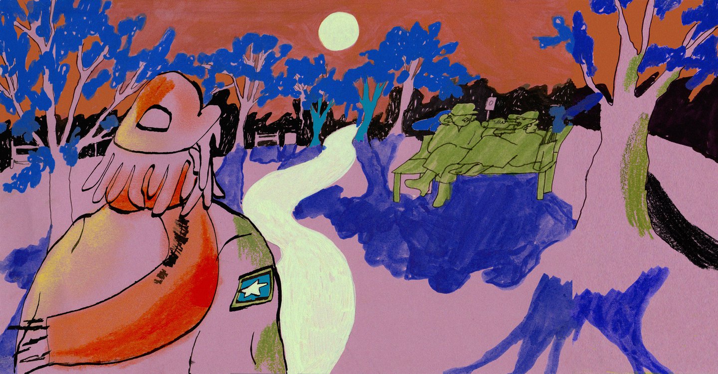
 It takes a lot of skill to make something so perfectly like a neighborhood pizza joint and also sophisticated. The humor and the illustrations are so good.
 www.itsnicethat.com
I think that it's great that they talk to real creatives and get their perspectives. I'm very introverted but I have also learned to be very good in social situations.
 theinspirationgrid.com
Such a simple style, but the cohesive vision and execution makes it work so well.
 www.itsnicethat.com
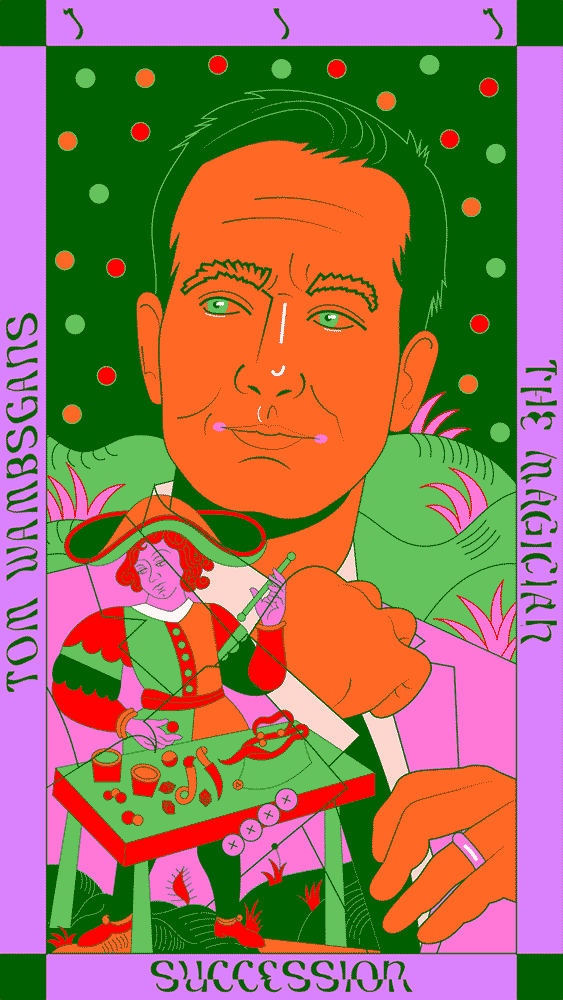
The idea is great, and the illustration style is wonderful. I love it when people use their design and passion to create unique ideas like this.
So many people try to tackle this style and get it very wrong. It feels like it aims for a "young" aesthetic, but it still is sophisticated in execution.